Modifiers
Modifiers in ComposeFlow
In ComposeFlow, Modifiers are powerful tools that allow you to decorate or augment composables to alter their appearance and behavior. By applying modifiers, you can customize UI elements without changing their core functionality.
What are Modifiers?
- Modifiers enable you to modify the properties of a composable.
- They can adjust layout, styling, interactivity, and more.
- Common uses include changing size, adding padding, setting background colors, and applying click actions.
Examples of Modifier Usage
- Modify Size: Adjust the width and height of a composable.
- Change Background Color: Set a background color for a composable.
- Add Padding: Add space around the content within a composable.
- Align Content: Position a composable within its parent layout.
- Apply Clickable Behavior: Make a composable respond to user interactions.
How to Add a Modifier in ComposeFlow
Step 1: Select a Composable
- Focus on the Composable:
- Click on the composable in the Canvas Area that you wish to modify.
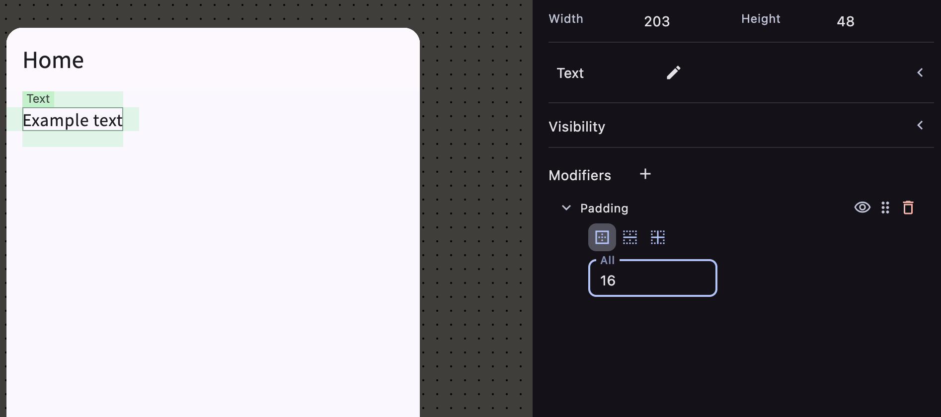
Step 2: Access the Modifier Inspector Panel
-
Option 1: Use the Modifier Inspector Panel.
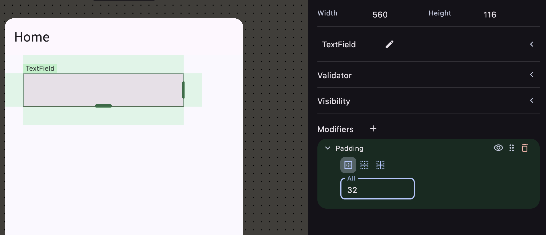
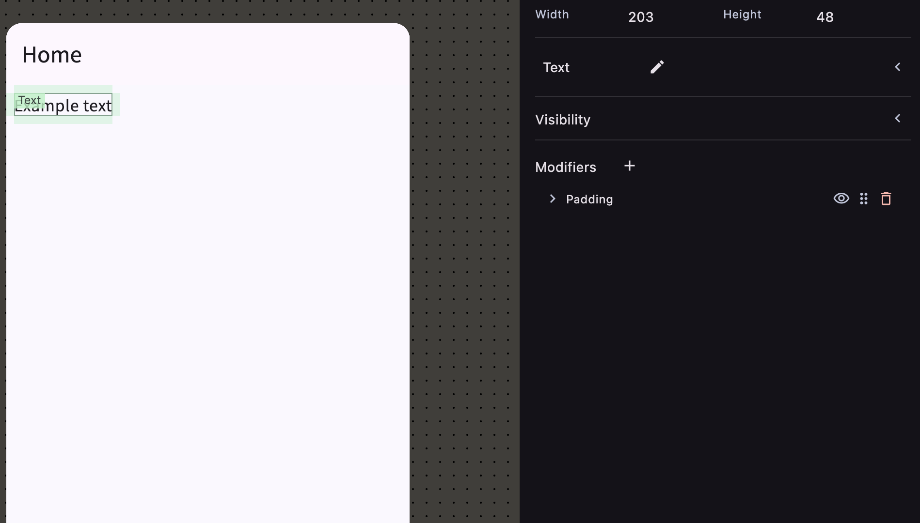
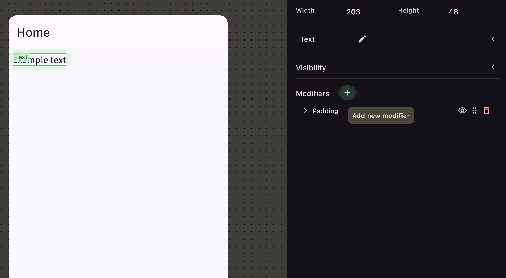
- In the Inspector panel on the right side, locate the “Modifiers” section.
- Click the ”+” button to add a new modifier.
-
Option 2: Use Keyboard Shortcut.
- With the composable selected, press the ”+” key on your keyboard to add a modifier.
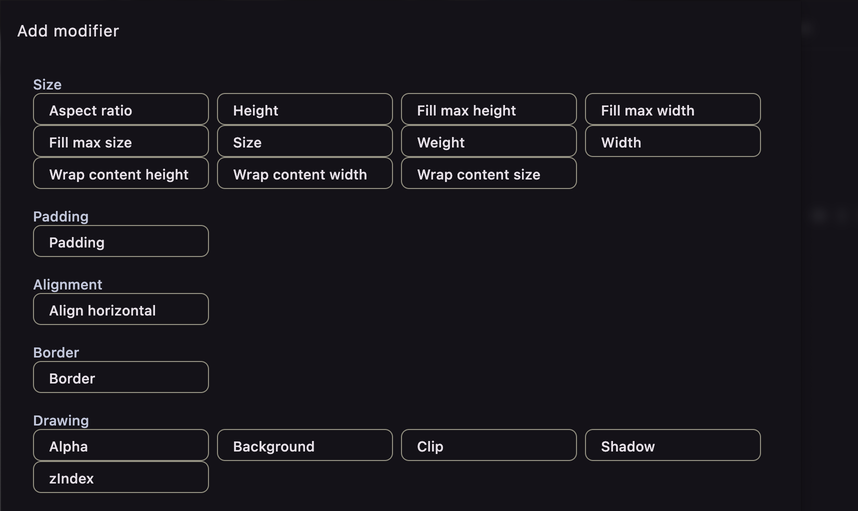
Step 3: Select a Modifier
- A list of available modifiers will appear.
- Browse or Search for the desired modifier (e.g., “Padding”, “Background Color”, “Size”).
- Select the modifier to add it to the composable.
Step 4: Configure Modifier Properties
- After adding the modifier, you can adjust its properties in the Inspector panel.
- For example, set the padding value, choose a color, or specify dimensions.
Understanding Modifier Order
- Modifier Order Matters:
- The order in which modifiers are applied can affect the final appearance and behavior of the composable.
- Modifiers are applied sequentially from top to bottom.
Reordering Modifiers
-
Open modifier editor
- Click the pencil icon in the Modifiers section to open the modifier editor
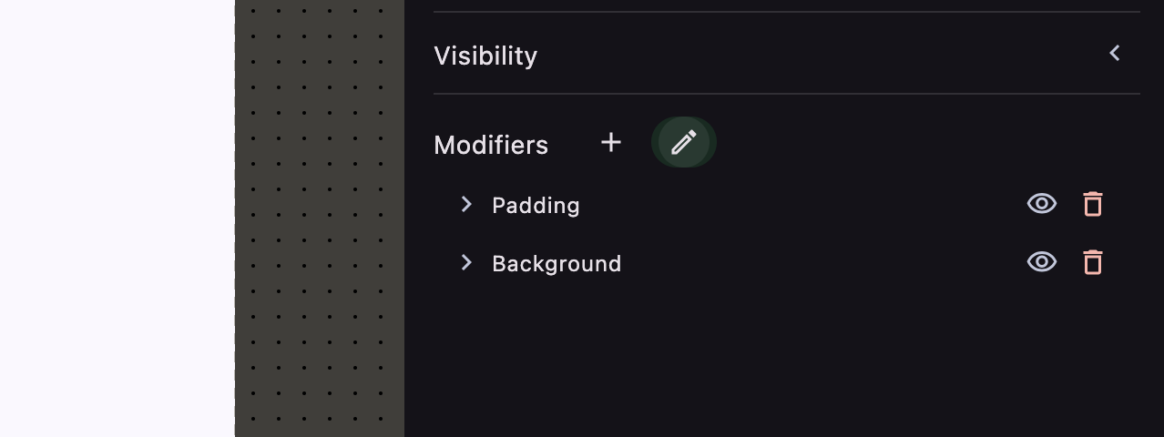
- Click the pencil icon in the Modifiers section to open the modifier editor
-
Drag and Drop:
- In the Modifiers editor, you can reorder modifiers by dragging them up or down.
- Click and hold the drag handle next to a modifier to move it.
Example
- Applying Padding Before Background:
- If you apply Padding before Background Color, the padding will be included within the background.
- Applying Background Before Padding:
- If you apply Background Color before Padding, the background will not include the padding area.
Tips for Using Modifiers
- Experiment with Order:
- Try different modifier orders to achieve the desired effect.
- Combine Modifiers:
- You can apply multiple modifiers to a single composable for complex customizations.
Common Modifiers and Their Uses
-
Padding:
- Adds space inside the composable’s boundary.
- Useful for creating breathing room around content.
-
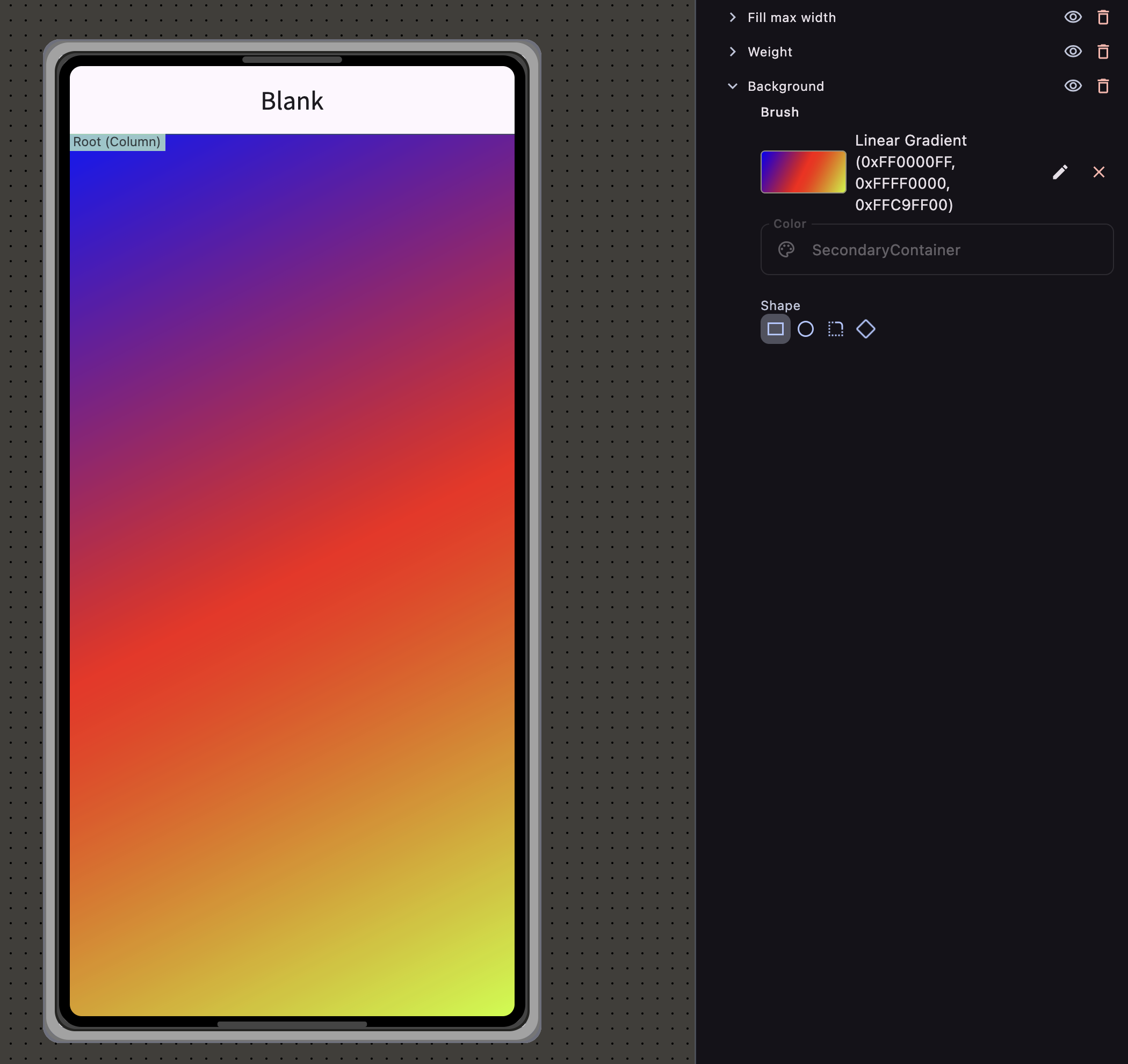
Background Color:
- Sets the background color of a composable.
- Enhances visual distinction or highlights elements.
-
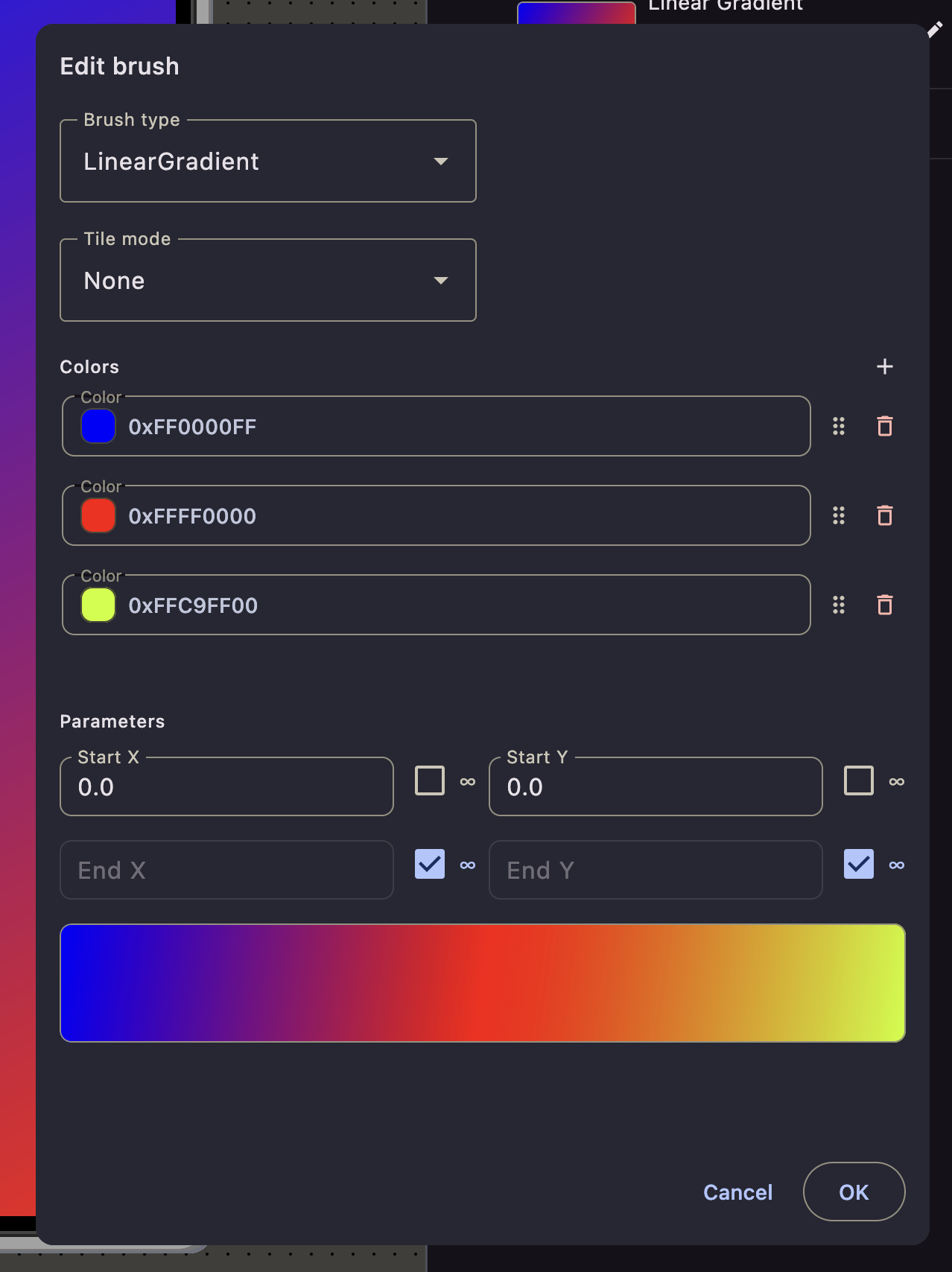
Background Brush (Gradients):
- Creates advanced gradient backgrounds with multiple colors.
- Supports various gradient types and customizable color stops.
-
Size:
- Specifies the width and height.
- Controls how much space the composable occupies.
-
Alignment:
- Positions the composable within its parent layout.
- Align left, right, center, top, bottom, etc.
-
Clickable:
- Makes a composable respond to click events.
- Useful for images or containers that need to be interactive.
Removing a Modifier
- To remove a modifier:
- In the Modifiers section of the Inspector panel, locate the modifier you wish to remove.
- Click on the trash icon or right-click and select “Remove”.