UI basics
UI Basics in ComposeFlow
Understanding the fundamental UI building blocks in ComposeFlow is essential for designing intuitive and engaging user interfaces. This document provides an overview of the UI basics, focusing on:
- Composables
- Components
- Screens
Composables
Composables are the primitive UI building blocks in ComposeFlow. They represent the smallest units of UI that you can use to construct your application’s interface. Composables are analogous to widgets or views in other frameworks and are based on the concept of composable functions from Jetpack Compose.
Examples of Composables:
- Text: Displays textual content.
- Icon: Shows an icon from a predefined set or custom assets.
- Image: Renders an image from local resources or remote URLs.
- Button: An interactive element that triggers actions when clicked.
- TextField: Allows user input of text data.
- Checkbox: Represents a binary choice, either checked or unchecked.
Usage in ComposeFlow:
-
Drag-and-Drop Interface: Add composables to your screens by dragging them from the components library onto the design canvas.
-
Modifier Configuration: Customize composables by setting
Modifiersuch as color, size, text content, and more through the inspector panel.See Modifiers page for more details.
-
Event Handling: Assign actions to composables like buttons by defining event handlers that respond to user interactions.
See Actions page for more details.
Layout Composables
Some composables are designed to have child composables, enabling you to build hierarchical UI structures. These are known as Layout Composables, and they determine how their child composables are arranged on the screen.
Key Points:
-
Hierarchical Structure: Layout composables allow you to nest composables within each other, creating a tree-like UI hierarchy.
-
Parent-Child Relationship: How child composables are laid out depends on the parent layout composable.
-
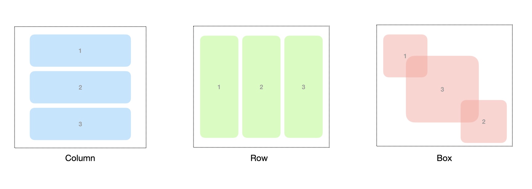
Common Layout Composables:
- Column:
- Arranges child composables vertically, one after another.
- Useful for stacking elements from top to bottom.
- Row:
- Arranges child composables horizontally, side by side.
- Ideal for placing elements next to each other.
- Box:
- Stacks child composables on top of each other.
- Useful for creating overlays or backgrounds.
- Column:
Usage in ComposeFlow:
- Adding Child Composables: Drag and drop composables into a layout composable to build your UI hierarchy.
- Customizing Layouts: Adjust properties like alignment, spacing, and padding to fine-tune how child composables are displayed.
- Combining Layouts: Nest different layout composables within each other to create complex and responsive UI designs.
Components
Components are collections of composables grouped together to create reusable UI elements. They encapsulate complex UI patterns or functionalities, allowing you to maintain consistency and streamline your development process.
Characteristics:
- Modular Design: Components promote modularity by encapsulating related UI elements and logic.
- Reusability: Once created, components can be reused across multiple screens and projects.
- Parameterization: Components can accept input parameters to customize their behavior and appearance when reused.
Examples of Components:
-
User Profile Card:
- Composed of an
Imagefor the avatar,Textfor the username, and additionalTextorIconcomposables for status indicators. - Used in lists of users, messages, or social feeds.
- Composed of an
-
Product Item:
- Combines an
Imageof the product,Textfor the name and price, and aButtonto add to cart. - Utilized in shopping apps to display items in a catalog.
- Combines an
Creating Components
- Select a Composable: Select a composable you want to conovert to a component.
- Right click: Open the context menu by Performing the right click.
- Select
Convert to Component: Use the “Create Component” option to encapsulate them. - Add name to the component: Add name to the component.
- Reuse: Drag the newly created component from the components library onto any screen.
Screens
Screens are the top-level containers that represent distinct views or pages within your application. Each screen is a composition of composables and components arranged to deliver specific functionality or content to the user.
Characteristics:
- Entry Points: Screens are accessed through navigation and represent different sections of your app.
- Layout Structure: Define the arrangement of UI elements using layout composables like
Column,Row, orBox.
Examples of Screens:
-
Home Screen:
- Provides an overview or dashboard with key information and navigation options.
- May include components like a welcome message, featured content, or quick actions.
-
Login Screen:
- Allows users to authenticate with credentials.
- Contains
TextFieldcomposables for username and password, and aButtonfor submission.
-
Settings Screen:
- Offers configurable options for the app.
- Utilizes components like toggles, sliders, and dropdown menus.
Building Screens
- Click new screen button: Click the new screen button at the top-left corner of the canvas area.
- Select the screen template: Select the screen template from the built-in list of screens.
- Name the screen: Add the name to the screen.
Relationships Between UI Building Blocks
- Composables are the fundamental elements used to build Components.
- Components are higher-level constructs made up of multiple composables, designed for reuse and encapsulation.
- Screens are composed of composables and components, forming the complete user interface for a particular view in your app.
This hierarchical structure allows you to build complex interfaces efficiently by reusing and nesting elements.