Component System
ComposeFlow’s Component System allows you to create reusable UI elements that can be used across multiple screens and projects. This powerful feature helps you maintain consistency, reduce development time, and create scalable applications.
Key Features
Reusable
Create once, use everywhere. Components can be used across multiple screens and projects without rebuilding the same UI patterns.
Self-Contained
Components include their own layout, styling, and behavior. Everything needed for the component to function is encapsulated within it.
Customizable
Components accept parameters to vary their appearance and behavior, making them flexible for different use cases.
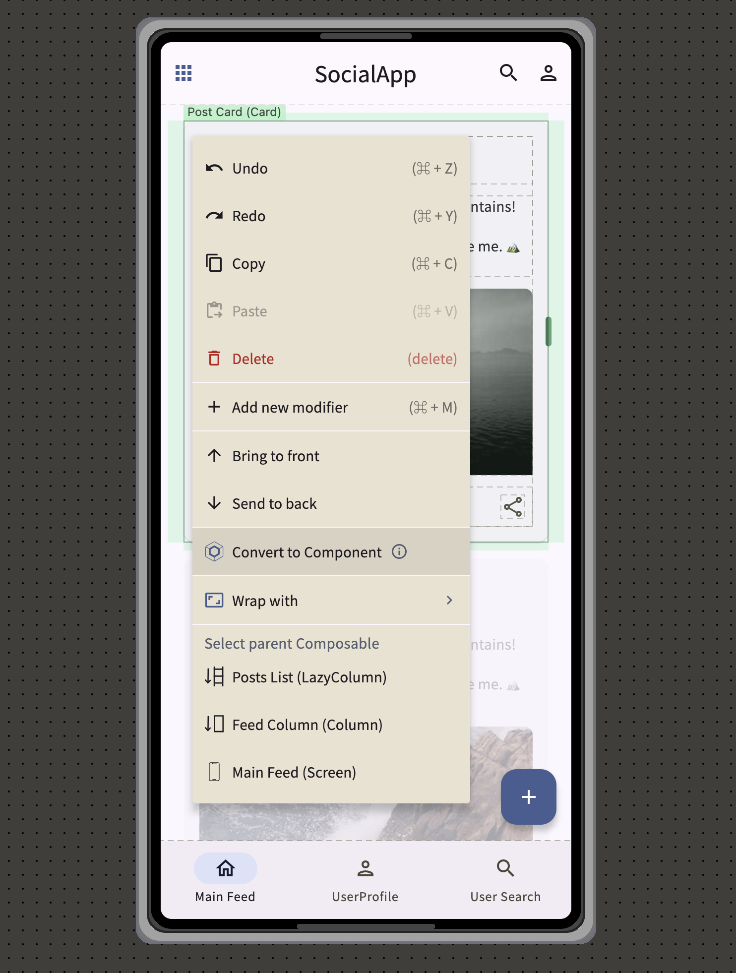
Example Use Case: PostCard Component
Consider a PostCard component for a social media app that displays user posts:
Initial Creation:
- Create a PostCard component in a LazyColumn for the main feed
- Include user avatar, name, post content, like button, and comment count
- Make it customizable with parameters for user data and post content
Reusable Across Screens:
- Main Feed: Display all posts in a scrollable list
- Search Results: Show matching posts when users search
- User Profile: Display posts from a specific user
- Saved Posts: Show bookmarked posts
Benefits:
- Consistency: All post displays look and behave the same
- Efficiency: No need to recreate the post layout for each screen
- Maintenance: Updates to PostCard automatically apply everywhere it’s used
Creating Components
From Existing UI Elements
- Design Your UI Pattern: Create the desired layout (e.g., PostCard with avatar, text, buttons)
- Select Elements: Choose all elements that should be part of the component
- Convert to Component: Right-click and select “Create Component”
- Configure Parameters: Define which properties should be customizable (user name, post text, etc.)
- Save: The component is now available in your component palette
Using Components
- Access Component Library: Find your custom components in the left component palette
- Drag and Drop: Place the component on any screen
- Customize Instance: Set parameter values specific to each usage
- Bind Data: Connect component parameters to app state or data sources
Best Practices
- Single Purpose: Each component should have a clear, focused responsibility
- Consistent Naming: Use descriptive names that make the component’s purpose obvious
- Parameter Design: Make components flexible with well-designed parameters
- Test Reusability: Verify components work well in different contexts before finalizing
The Component System enables you to build consistent, maintainable UIs by creating reusable building blocks that can be used throughout your application.